From Bauhaus to font house.
Architype is a new series of Modernist typefaces. Is their reissue as simple as it sounds?
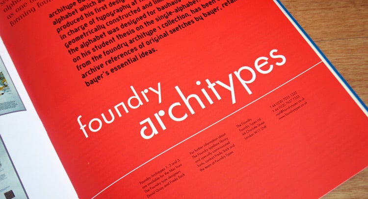
The period between the First and Second World Wars is one of the most interesting in design history, with the beginnings of the Modern Movement and the rise of the New Typography. The artists of the early avant-garde believed that art and design could help to build a new and better society, and their rejection of all forms of historicism and embellishment led them to embrace an aesthetic of clean, simple and functional forms. Although their ideas were suppressed by political change, their experimental work developed into the design language which became the foundation of Modernism.
Today’s experimental typography owes much to this period. But although some contemporary work is exciting and progressive, some merely follows the style of the earlier era without an understanding of the philosophy behind it. In the belief that the experimental type designs of the 1920s and 1930s deserve to be made available to a wider audience, we have issued a selection of typefaces with some substance and thinking behind them, linked by a common theme. Each face in the Architype series is based on an archetypal design by an influential figure of the European inter-war avant-garde which has inspired subsequent typographers. The designers we have chosen for our first volume are Theo van Doesburg, Herbert Bayer, Paul Renner, Jan Tschichold, Bart van der Leck and Max Bill.
References to the alphabets have appeared in books and journals, and both the Bauhaus-Archiv in Berlin and the Kröller-Müller in Otterlo supplied us with a wealth of photographic reference material. We chose alphabets with contrasting visual forms, but which were inspired by similar ideas. Most of them use a severely restricted geometric structure that reflects the artistic language of the movements from which they grew. Both Van der Leck and Van Doesburg, for instance, were founder members De Stijl, and the basic elements of that movement’s expression – the right angle and the three primary colours plus white, black and grey – are used in their typographic designs.
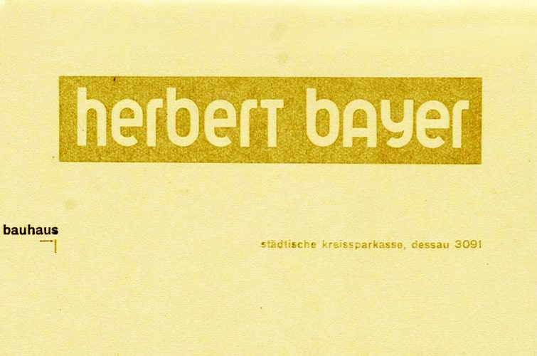
Herbert Bayer’s letterhead from 1925.
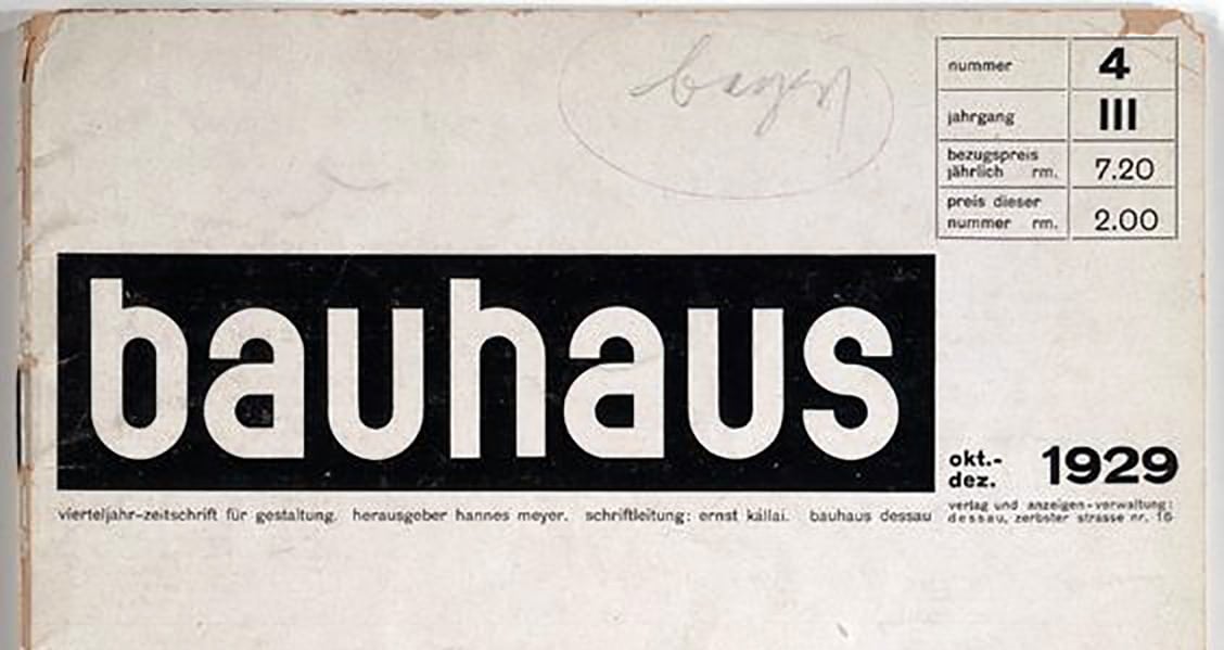
Herbert Bayer’s, ‘Bauhaus: Vierteljahr-Zeitschrift fur Gestaltung’, 1929.
Most of the designers were known to and influenced each other. Though typography was not included in its original manifesto, the Bauhaus proved a fertile meeting ground and was the catalyst for the development of many of the New Typography’s basic tenets. Bayer was a student and then master at the school, where he was inspired by a series of unofficial lectures given by Van Doesburg in 1921. Bill spent two years there as a student from 1927, and the continuing influence of Van Doesburg had a great impact on his work. Tschichold was greatly impressed by the publicity material designed by Bayer that he saw at the Bauhaus exhibition of 1923.
Tschichold was responsible for bringing the new ideas before an international audience, in particular through his publication Die Neue Typographie (1928). Among his principles were the beliefs that ‘sans serif is the type for the present day’ and that ‘we aim at simplicity – we require simple and clear typefaces.’ Renner is often associated with the Bauhaus, but was not a member. His work departed from the school’s strict geometric approach, and drew on his understanding of turn-of-the-century type models. His Futura type was described as ‘the type for our time’ by the Bauer foundry. Renner invited Tschichold to teach at his printing school in Munich from 1926 until 1933.
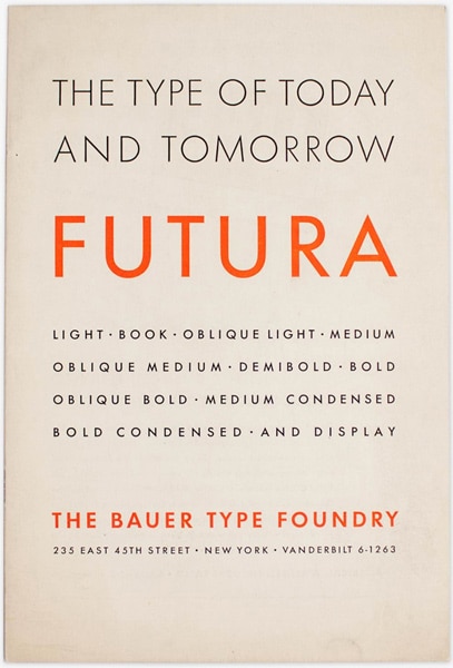
Futura specimen of issued by The Bauer Type Foundry.
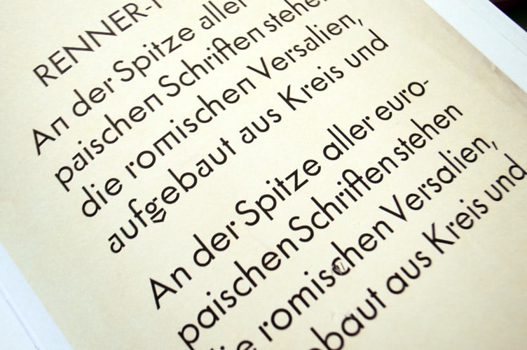
In each case we tried to work out how the originators of the alphabets would have designed the additional characters needed to produce a workable typeface. Often all we had to work on were experimental sketches or a small number of characters produced for a poster or some other piece of typography. With each alphabet we were conscious of the need to follow the designer’s intentions as closely as possible, but in a few cases we had to make subtle adjustments to improve the look of the letterforms.
Bill’s 1949 poster, for example, contains just a few words. But fortunately the simple shapes he used to create those letterforms were flexible enough to allow us to add all the missing characters without compromising his original idea. This was much more difficult in the case of Van Doesburg and Van der Leck because the restrictions imposed by the designers were more rigid. Van Doesburg’s alphabet uses uniform character widths to fit a predetermined grid system, with no diagonals to help with such characters as the figure 7. For Architype Van Doesburg we introduced a diagonal stroke for the percentage sign and the slash, since to keep strictly to the original grid would have rendered them unrecognisable. For Architype Van der Leck we closed up stencil-like space between the letterform strokes to less than a letterspace width, since we found the letters difficult to read when set in words.
Bayer’s experimental universal alphabet contains no subtle adjustments: horizontals and verticals are all the same weight, making the letterforms look cumbersome and letters such as the ‘e’ and ‘a’ fill in at small sizes. The fine optical adjustments we made to line weights may not have met with his approval since they stray from the geometric purity of his design, but we believe we have managed to keep the essence of his alphabet. Bayer produced several forms of the universal alphabet, including a condensed and a wider, rounded version. ITC Bauhaus is derived from the wider version, but is less rigorous in its geometry and opposes the spirit of his endeavour by including capitals. We chose to issue the condensed version, as there have been no other attempts at reproducing it.
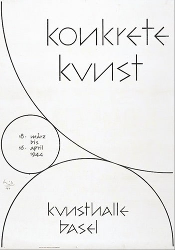
Max Bill’s ‘Konkrete Kunst Kunsthalle’, poster from 1944.
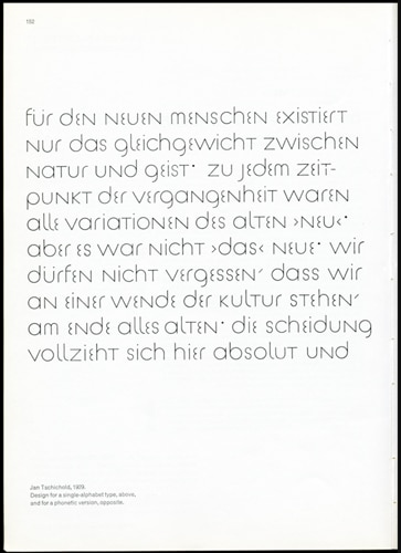
Jan Tschchold’s design for a ‘single’ alphabet, 1929.
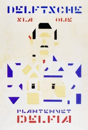
Van Der Leck, poster of Delfia Salad Oil Factories, 1919.
Although the Tschichold alphabet is also based on a strict geometry, the problems in drawing it were fewer because the letterforms use a finer line weight and the characters are of different widths. Tschichold’s ideas influenced the design of many geometric typefaces of the late 1960s and early 1970s, for example ITC Avant Garde Gothic and Cirkulus.
The geometry of Renner’s sans serif letterforms is tempered with optical correction. The capitals in particular follow the proportions of earlier type models, yet retain the spirit of the New Typography. His early experimental characters were not reproduced in the final version of his alphabet, which was to become the Futura typeface released by Bauer in 1927-30. We wanted to produce a version that reintroduced these characters, together with the old-style figures featured in early versions which had since disappeared from use. We redrew the whole font, following his drawings as closely as possible and refining his old-style figures and experimental characters in harmony with the rest of the alphabet.
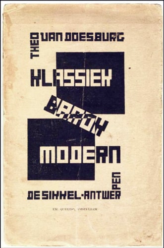
Van Doesberg ‘Klassiek Barok Modern’ 1919.
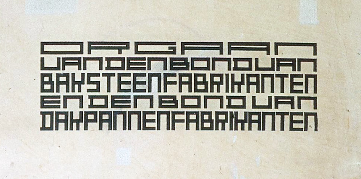
Van Doesberg’s lettering for the ‘Klei’ magazine 1919.
All the typefaces were drawn at 100 mm capital height or, in the case of lower case only faces, at 100 mm x-height. An analysis was made of each design and a grid devised showing the letterform construction. Every character required was then drawn using this grid. Our drawings were digitised on mainframe Ikarus by the technical partner in the project, Signus Limited. Where the designer’s intentions for letterspacing were obvious from the way the letterforms were originally used, this was adhered to. The fonts were then converted to the formats required to make them available for PC and Macintosh.
The second volume of Architype will include a 1931 experimental modern face by Bayer, Van Doesburg’s 1929 lettering for the Café Aubette, a bold version of Renner’s sans serif and alphabets by Kurt Schwitters, Bauhaus student Theo Ballmer, and Bauhaus student and later teacher Josef Albers. We hope that one of the routes that graphic design will take in the near future will involve a reassessment of Modernism and that by giving designers access to these typefaces we will be adding to the dialogue.
First published in Eye no. 11 vol. 3, 1993. With the kind permission from John L. Walters and Simon Esterson at Eye Magazine.
See more from the Architype Universal Collection, and the Architype Konstrukt Collection.
